The town’s director of community services, Shannon Baillon presented the latest versions of the town’s new branding images to be used in local signage, letterheads, and a variety of visual representations. The slogan ‘Heritage and Heart’ was recommended by staff over ‘Bridging Time’ as it would connect better with targeted tourism demographics. The town’s logo will be a stylized stone bridge, with different ones produced for the BIA, Chamber of Commerce and Museum.
The committee approved the final drafts and forwarded the matter on to the next full council meeting for ratification.


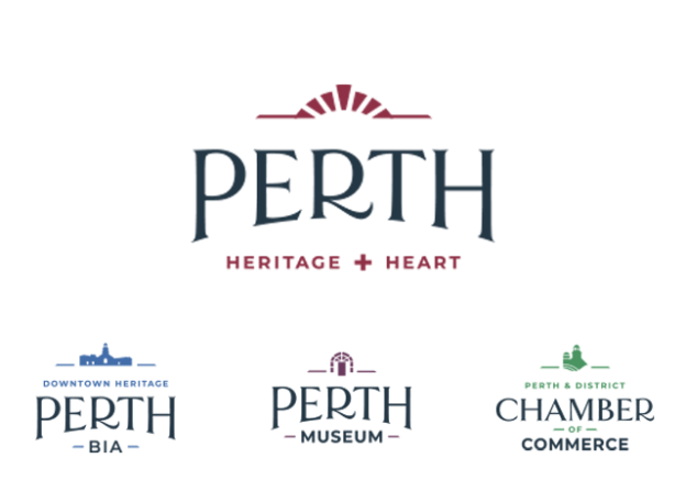












Just love the slogan Heritage + Heart. It describes Perth perfectly.
The specific logos are simple, yet sophisticated.
Well done and congratulations.
Catherine
Very bland and boring, do not like it, could have been better plus there was nothing wrong with the old logo, very disappointed in you town of perth